Pages

Wednesday, 7 December 2011

Evaluation Question 1: In what ways does your media product use, develop or challenge forms and conventions of real media products?

Music Video:


DigiPak and Advert:
(Click to Enlarge Image)
For some reason, the image viewer on Blogger has changed so that you cannot click and zoom in on the image to read it. I have enlarged the actual image and text but if you still cannot read it, there is a Prezi (below) where you can zoom in onto the image to make it easier to read:

Evaluation Question 2: How effective is the combination of your main product and ancillary texts?


For this question, I have created a website/presentation for the ‘Branding’ of Joe Newman. I used Wix to complete this because I could embed my music video into the page, along with my DigiPak and Advert close ups to show comparison between the three products. This is what the page looks like but if you cannot see it very well then here is the link to the page. (In order to view it full-screen to get an overview of the page, just press F11 when the webpage has opened and loaded):

Evaluation Question 3: What have you learned from your audience feedback?

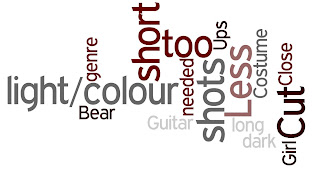
Feedback has been vital throughout the pre-production, production, post-production and evaluation stages. It has enabled me to make sure that my target audience is satisfied with the products and to ensure that the purpose of the Music Video, DigiPak and Advert are suited to the audience and genre. Feedback has not only been useful from the audience, but my teachers and Joe himself. The following tag clouds are created using Wordle by me and I have decided to use the colour scheme of Heat because the red/brown colours and greys suit my DigiPak and Advert:
First Draft of Ancillary Products (DigiPak and Advert):

Audience Feedback (Positive):-

Audience Feedback (Negative):-


The first set of feedback that I received was for my ancillary products. It was mostly negative for the first draft because they were only hand-drawn designs and so audience members could only visualise themselves on what they think they might look like. This feedback made me realise that I needed to organise my time more effectively in order to produce several ‘real’ designs to show them – so I could gain some relevant feedback that would be more constructive. After this feedback, I planned my time better for the rest of the production.
Teacher Feedback (Positive):-


Teacher Feedback (Negative):-


My teacher's feedback for my ancillary products’ first draft was similar to my target audience feedback – it was difficult to change aspects of the DigiPak when there was no original to look at in the first place. One of the key points that stood out though was that the Union Jack and that I needed to research more into its usage elsewhere. After researching, I realised that only certain bands (such as The Sex Pistols) were able to get away with using it and I also researched into just the texture effects of the wall; which received further feedback that that was effective without the Union Jack. This feedback has made me learn that constructive criticism can be very useful when thinking of ideas because sometimes ideas can seem really effective when thinking to ourselves but might not be aiming in the right direction in terms of what appeals to the target audience.
First Draft of Music Video:
Audience Feedback (Positive):-

Audience Feedback (Negative):-


A lot of the feedback from the audience relating to the first draft of the music video brought to my attention that the shots were too long and that there were too many shots of just Joe walking alone. Because of this, the feedback also concluded that the audience were becoming disinterested in the music video and was making the whole purpose of the music video void. I therefore took all of the feedback from the relevant target audience members and began to rethink my ideas as to narrative and faster paced editing. The positive feedback that I did receive showed that Joe was convincing as the artist and this made me feel more optimistic and more enthusiastic towards thinking of an effective narrative.

Teacher Feedback (Positive):-


Teacher Feedback (Negative):-


Apart from the shots being too long, my teacher’s feedback was very important towards getting the editing and technical aspects right (such as the mise en scene for the female narrative sequences of shots). Both of my teachers gave feedback that was very useful because none of the feedback was contradicting and enabled me to feel more confident when filming Amy’s sections of the video.

Final Cut of Music Video:


Audience Feedback (Positive):-


Audience Feedback (Negative):-


A lot of the feedback that I received was constructive (nearly all) and has helped me to re-think ideas that maybe would be too cloudy in the music video (especially the narrative). It was important to gain as many different opinions and views as possible so that I could pick out the useful comments from my target audience and the ones that would not actually appeal to the target audience.

The final set of positive comments that came from the target audience showed that I have followed the right advice and feedback throughout the editing stages by changing the cutting-pace of the shots in order to make it more interesting and the narrative aspect also seemed to be understood by many audience members. What I have learnt throughout the process through feedback is to accept the negative feedback and use to develop my products and turn it to constructive usage instead of taking offense. Overall, I am happy with the feedback that I received from my target audience and teachers because they allowed me to refocus my products to make them more effective as a combination and as individual products.

Evaluation Question 4: How did you use media technologies in the construction and research, planning and evaluation stages?

Thursday, 24 November 2011

Final Music Video

Black and White Idea with Amy's Sections - Music Video

In order to gain audience and teacher feedback about the black and white idea for Amy’s sections of the music video, I have constructed a comparison video including both of the sections in colour and sections in black and white (side by side). This is only the video in progress and so is not complete/finalised yet anyway:


The feedback that I received from both my teacher and my target audience is that the black and white looks good on Amy’s shots but does not justify its usage when in the narrative of the music video. This is because the relationship between Joe and Amy is simultaneous throughout the music video (the relationship being that they are both looking back/regretting them both breaking up). Because both of them seem to be looking at the photos at the same time (created by the editing), it would not make sense if Amy is portrayed as being in the past by the black and white. I therefore am going to keep it in colour but continue to edit it further – as there is still work to be done!

Thursday, 17 November 2011

Filming Overview - Wednesday 16th November 2011

Last night I completed the filming for the sections where Amy will be in the music video. Tomorrow, my teacher said that she will go through the footage to see if it is appropriate for the idea of them once having a relationship. I am confident that it will work and am now thinking about whether Amy's sections should be in black and white and not in colour. By incorporating a female in the music video, I can now be more creative in terms of editing effects (such as fading to white to show flashbacks/what is in the past). There are no current transitions in the music video so that is what I am going to experiment now.

Wednesday, 16 November 2011

Update on Shooting Music Video - Production Schedule

After my feedback from my teacher, I have really pushed forward the idea of having Amy and Joe in a once relationship and so Wednesday night (tonight) I am going to film the parts of the music video with just Amy. The production schedule slip is what I have constructed so that I know what I need to take with me to the shoot.

Friday, 11 November 2011

Teacher Feedback for Music Video Draft

From this feedback, I am now clearer on what I need to do in order to make my music video a level 4 (because that is what I am aiming to achieve).  Not only that, but my teacher highlighted parts of the music video’s lip syncing which needs changing in order to make it more convincing. The making of this music video has already taught me the importance of editing and that moving the video a tenth of a second can make the lip-syncing go out of time or look wrong to the audience.
   Too many shots of Joe walking alone was another key point and so I am going to try to rectify this on Wednesday after college because Amy has agreed to give filming another go if she is on her own. Props were mentioned to increase interest and so I am going to try to use a mobile phone with an image of the two of them from the other week so that both Amy and Joe can be looking at it – creating a sense of a once relationship.
   The ending of the music video was one that my teacher and I discussed and we both think that maybe changing it (depending on how successful the persona of Amy comes across) to where Joe is either throwing away a photo of them two or is storing it somewhere. These ending will have a different overall effect because he either has moved on or hasn’t. At this current point, I am more convinced to go with the idea that he has moved on.

Final Magazine Advert

(Click to Enlarge)
The idea of the advert was that it would only be A5 size (half a magazine page) in a magazine. I think this size would work best with the image that I used for the DigiPak front cover and I didn’t want to use a different image for the advert because there would not be a direct link between them. My research also showed me that the majority of adverts had the front cover image used on them.

Final DigiPak

(Click to Enlarge)

DigiPak and Advert Further Developments

FRONT COVER:

One choice that my teacher recommended I should look at was whether to enlarge the image of Joe on the front cover in order to make it suit the space more. This was the current design:
And this was the design with the image enlarged:

I have chosen to use the second layout because I think that the space is used better and it makes the cover stand out. It also brings out the text clearer with the red and white highlights in the image.

BACK COVER:

Furthermore, after I had completed the back cover design below and printed it out, I noticed that the credits at the bottom do not stand out as well as they should. I therefore made the tint of red slightly lighter which made a big different in the readability of the text.
(Click to Enlarge - Above Design has a lighter tint of red for the Credits)
INSIDE COVER:

I decided to have the text of the lyrics from the song ‘Boulevard of Broken Dreams’ going down the inside cover. I manipulated the image of the close up shot of Joe to match the design of the front cover. This is a shot of the inside cover in progress:
CD PANEL:
For the panel where the CD will be held, I wanted to keep the design simple but match the colour scheme that I used for the left and right inside panels with the lyrics on. I created a silhouette effect on the image and then filled in the background with the same colour as used for the background on the others.

I thought it would be appropriate to put the credits for the album on the centre panel and the red and white text colour scheme I thought would stand out the most on the dark background.

Thursday, 10 November 2011

DigiPak Inside Cover Development

From my teacher’s feedback about the credits being too big and therefore will not give enough room for all ten song lyrics on the inside cover. What I have decided to do is put the credits on the middle panel of the inside (where the CD will be held). This is therefore the two outer inside panels to go either side of the CD:

I have included the Enigma Records Logo in design because on the previous research of the American Idiot album contents. What I think does need to be on the page is a red colour of some shade so that it matches the front of the DigiPak and because the previous design with the red subtitles worked well.

I typed up the lyrics for the songs using the 'American Idiot' album booklet by Green Day:


For the songs that were not by Green Day, I used Snow Patrol's album 'Eyes Open' for the lyrics.

Studio Logo - Developing a Record Company Logo


In order to make my ancillary products look more professional and realistic, I have completed some research into record company logos to come up with one of my own. The Reprise Records logo above is the record company that is the label for Green Day and I really like the idea of having the first letter bigger than the rest of the text. Therefore, I have decided to complete a simple logo for my record company as well (using the name of Enigma Studios that I used in my previous coursework for AS – below).

 
This is the logo I am going to use on my DigiPak and Magazine Advert:

DigiPak - Developing the Inside Cover

For the inside of my DigiPak, I was planning to include some of the lyrics from the album and the list of credits that ‘contributed for the making of the album’. The credits and layout (colours) were inspired by this booklet cover of the American Idiot album by Green Day:

I particularly like the idea of having red headings with the white text on a darker background and so these are the initial designs:


Out of the three above, I like the way that I manipulated the last design in order for a silhouette effect to be given. Although the first two are more detailed because I only reduced the amount of colours in the picture to three, I believe that the silhouette effect enables the white text to be clearer to the audience and I now think that the original photo that I took of the houses (shown below) was the right decision because it still likes in with roads.
(Original Photograph that I took of the house roofs)

DigiPak - Editing


Monday, 7 November 2011

Photo-Shoot for Magazine Advert and DigiPak Photos

These are some of the original photos that I took of Joe. The location that I used for the photo-shoot was just my back garden because I nailed a white canvas onto the fence in order for the editing on PhotoShop to be easier. Because of the white background, I can easily cut out Joe and then place him on another background (I’m planning for the background to be a wall texture):

(Click to Enlarge - Photo of rhe Canvas Screen that I used behind Joe for the Photo-Shoot)

Sunday, 6 November 2011

Target Audience Feedback

The crucial advice that I greatly value is from my peers and target audience members (as well as from my teachers). As my peers are mostly the target audience anyway, it has been easy to gain initial feedback from my developing work and my drafts.

Music Video Feedback:

·         Target Audience Member 1: ‘I really like the concept but like you mentioned underneath the clip, some of the shots are too long and I find it hard to keep interested in what is happening on screen. As a positive, I think that the artist suits the lip-syncing really well and makes that more convincing.’

·         Target Audience Member 2: ‘I think that some movement in the shots should be used instead of just static shots all the time. Even some movement created by the editing software using the footage you’ve got could work. I think this would make it more entertaining to watch.’

·         Target Audience Member 3: ‘If you are using a female in your music video, I think that transitions could be used such as fading in order to hint that they were together but are no longer. A lot of the music videos I have seen have slightly faster pace in the editing and so try to vary the shots. What you could do is take some close ups of both the female and the artist to make the people who are watching it more interested and captivated.’

·         Target Audience Member 4: ‘A black and white effect I believe would look really good on the music video; especially if you are using the focus point of Joe splitting up with the female.’

DigiPak/Magazine Advert Feedback:

·         Target Audience Member 1: ‘I like the wall texture behind the artist but I don’t understand why the front cover has just a face in the middle. I would suggest having a picture of Joe having a guitar and looking at the camera directly so that the guitar shows that it is in the rock genre immediately.’

·         Target Audience Member 2: ‘The fonts that I have seen on previous posts I really like but I think that just a simple font would be more suitable and clear from a distance (for the advert especially). Therefore, it would not take away the detail of the wall texture behind him.

·         Target Audience Member 3: ‘I’m unsure whether the cover will just be black and white or colour. I would suggest having a look at some of the Green Day cover’s that have black and white with some colour; which makes them stand out more.’

Tuesday, 1 November 2011

Teacher Feedback for Digipak/Advert Drafts


(Click to Enlarge)
The feedback that I have received from my teachers has really helped me with my developing ideas because it has allowed me to spot aspects of my Digipak and Advert that do not work as well as they could. For example, a comment about the Union Jack was mentioned and that I should research a bit more in-depth to its usage. What I found was that the Union Jack has caused some controversy about racism and so in the current times, the Union Jack may not be as suitable as it was for other bands that have incorporated it into their designs (such as The Who and The Sex Pistols). After much thought anyway, it would have made the design more difficult and could have taken away the simplicity of the effect that I have put on the photo of Joe.
In order to keep continuity through the Digipak and Advert, a suggestion of using a mid-shot photo of Joe on the front cover and the advert would be more appropriate because it shows the rock genre and would make the cover more interesting to look at.
I know that my drawing designs of both the DigiPak and Advert were not the easiest of designs to comment on because they were quite simple. What I plan to do now is to show my teachers every step of my editing (and Blogging it too) to show progress and compare between certain features on each design. This will gain me feedback from not only my teachers but target audience members as well.

Thursday, 27 October 2011

Music Video - Draft

This is my first draft of my music video using the footage that I filmed from the three locations (Scare Farm, Whistle Way and the AVS Studio):


After looking back over it (many times!), I know that some of the shots are too long between the choruses and verses and so I need to now film some more shots to split up the intervals and make more action happen to make it more exciting.

"Your choice of artist is great; he looks relaxed and authentic whilst singing.
The locations link together with the lyrics and the choice of shots look effective.
You've already indentified that some shots can be split to create a faster pace.
Overall this video looks great :)"

Feedback from Julia Harvey

Post-Production - Using Premiere Elements

(Click to Enlarge)

Monday, 24 October 2011

Filming Overview - Shots of the Shots

These are a few screenshots from the footage that I have filmed so far:


(AVS Studio Footage – October 13, 2011):
(Click to Enlarge)

(Whistle Way Footage – October 20, 2011):
(Click to Enlarge)

(Scare Farm Footage – October 23, 2011):

(Click to Enlarge)

Sunday, 23 October 2011

Update on Shooting Music Video - Production Schedules/Overview

The shooting of the first draft has nearly been completed. I have filmed the footage on three separate days, the first being at Lutterworth College in the AVS Studio and the other two during the half term at Whistle Way and Scare Farm.
(The AVS Studio Production Schedule):
(Click to Enlarge)
The AVS Shoot went really well. I was very impressed with how quickly Joe managed to pick up the lip-syncing (which was helped by him knowing the lyrics so well). The Artificial Lighting used allowed a shadow to be picked out behind him because the light was angled upright below him.

(The Whistle Way Production Schedule):
(Click to Enlarge)
The second day of filming was during the half term and I was surprised on how little disturbance we actually got from passersby and so the overall film went quite smoothly. The only thing that may be an issue is that the wind was fairly strong and could be shown in the footage.
(The Scare Farm Production Schedule):
(Click to Enlarge)
Finally, the last day of filming for the first draft was at Scare Farm. Because most of the footage had been shot previously, this location was mainly for the setting and establishing shots for each verse to create the overall atmosphere. I’m confident that the shots that I took worked for the mood that I wanted to create (by the idea of him being alone – using the extreme long shots and shots of him walking away from the camera).


I will post some shot sequences in progress shortly as now the post-production stage begins; editing!

Thursday, 13 October 2011

First Draft of DigiPak/Advert

This is the first draft of my ancillary products to go with the music video (DigiPak/Magazine Advert). I have only constructed drawings at this moment in time because I thought that it would be best to design them before testing many photographs and effects on Photoshop. I now have a clear idea on the typography, composition, photography (shot types/locations) and effects just by completing these designs.
(Click to Enlarge - DigiPak Design)

(Click to Enlarge - Magazine Advert Designs)
For the Magazine Advert, I haven’t quite decided on whether to have a long shot or mid shot of Joe’s silhouette against the Union Jack behind him and so I have created two designs with the same concept so I can gain feedback from audience members and teachers.

Analysis of Existing Album Artwork - Frank Turner

(Click to Enlarge)