Pages

Thursday, 27 October 2011

Music Video - Draft

This is my first draft of my music video using the footage that I filmed from the three locations (Scare Farm, Whistle Way and the AVS Studio):


After looking back over it (many times!), I know that some of the shots are too long between the choruses and verses and so I need to now film some more shots to split up the intervals and make more action happen to make it more exciting.

"Your choice of artist is great; he looks relaxed and authentic whilst singing.
The locations link together with the lyrics and the choice of shots look effective.
You've already indentified that some shots can be split to create a faster pace.
Overall this video looks great :)"

Feedback from Julia Harvey

Post-Production - Using Premiere Elements

(Click to Enlarge)

Monday, 24 October 2011

Filming Overview - Shots of the Shots

These are a few screenshots from the footage that I have filmed so far:


(AVS Studio Footage – October 13, 2011):
(Click to Enlarge)

(Whistle Way Footage – October 20, 2011):
(Click to Enlarge)

(Scare Farm Footage – October 23, 2011):

(Click to Enlarge)

Sunday, 23 October 2011

Update on Shooting Music Video - Production Schedules/Overview

The shooting of the first draft has nearly been completed. I have filmed the footage on three separate days, the first being at Lutterworth College in the AVS Studio and the other two during the half term at Whistle Way and Scare Farm.
(The AVS Studio Production Schedule):
(Click to Enlarge)
The AVS Shoot went really well. I was very impressed with how quickly Joe managed to pick up the lip-syncing (which was helped by him knowing the lyrics so well). The Artificial Lighting used allowed a shadow to be picked out behind him because the light was angled upright below him.

(The Whistle Way Production Schedule):
(Click to Enlarge)
The second day of filming was during the half term and I was surprised on how little disturbance we actually got from passersby and so the overall film went quite smoothly. The only thing that may be an issue is that the wind was fairly strong and could be shown in the footage.
(The Scare Farm Production Schedule):
(Click to Enlarge)
Finally, the last day of filming for the first draft was at Scare Farm. Because most of the footage had been shot previously, this location was mainly for the setting and establishing shots for each verse to create the overall atmosphere. I’m confident that the shots that I took worked for the mood that I wanted to create (by the idea of him being alone – using the extreme long shots and shots of him walking away from the camera).


I will post some shot sequences in progress shortly as now the post-production stage begins; editing!

Thursday, 13 October 2011

First Draft of DigiPak/Advert

This is the first draft of my ancillary products to go with the music video (DigiPak/Magazine Advert). I have only constructed drawings at this moment in time because I thought that it would be best to design them before testing many photographs and effects on Photoshop. I now have a clear idea on the typography, composition, photography (shot types/locations) and effects just by completing these designs.
(Click to Enlarge - DigiPak Design)

(Click to Enlarge - Magazine Advert Designs)
For the Magazine Advert, I haven’t quite decided on whether to have a long shot or mid shot of Joe’s silhouette against the Union Jack behind him and so I have created two designs with the same concept so I can gain feedback from audience members and teachers.

Analysis of Existing Album Artwork - Frank Turner

(Click to Enlarge)

Typography Research

I have research into different fonts on the Dafont.com website (Click HERE to open link) and have narrowed down the many different styles of typeface to these six:

The reason why I haven’t used any fonts from the Microsoft Packages is because I do not think that they would suit the rock genre (unless I used a plain bold font). After asking several of the target audience members on what they think, they have said that the most suited out of them six were these three:

I have used the grey background because it is a section of a photo of a wall that I just made grey-scale (as that is the colour scheme that I am thinking of at the moment).

Wednesday, 12 October 2011

Re-Post of the Previous Album Cover Research - Snow Patrol/Green Day


Just to show that I produced research earlier into album artwork, this is a re-post of the two analysis that I completed earlier on in the research and planning stage:

1. Album/Single Covers Analysis - Snow Patrol:

Another part of the marketing campaign that I have to produce to promote the artist’s song release is an album/single cover with the digipak. I have only looked at the covers to gain inspiration at this point such as artistic effects and motifs that are used for popularity and links to other album covers:

(Click to Enlarge)


I have gained a lot of inspiration from this task because I know that I can apply my creativity to not just the filmmaking but the photography and manipulation editing of the photos as well. I particularly like the watermark effects and has even inspired me to think of that effect in my music video maybe.

2. Album/Single Cover Analysis - Comparison between the Subgenres:
In order to establish the difference between the subgenres in the Alternative Rock genre, I have compared the ‘Eyes Open’ album cover by Snow Patrol (in the Indie Rock subgenre) with the ‘21st Century Breakdown’ album cover by Green Day (Punk Rock subgenre):

(Click to Enlarge)

From this task, I have learnt that the typography, colour, composition and use of motifs can really help determine what a particular audience will go for when they browse for a CD and how important the album artwork is to the sale of the song. As I am thinking of using the ‘Boulevard of Broken Dreams’ song by Green Day, it will be the more modern and vibrant colours that I should think about; depending if that will suit the song and music video.

Analysis of Existing Album Artwork - Andrew W.K.

In this analysis, I have compared two album covers by Andrew W.K. because there is only a two year gap between the albums (and the covers are very different). I have looked at the photography used and the composition of the album cover; as well as the typography, colour and overall style.

Monday, 10 October 2011

Existing Cover Artwork - Colour Used


(Alternative Rock)


(Alternative Rock/Post-Grunge/Hard Rock)


(Indie Rock/Punk)

Existing Cover Artwork - Minimum Colour Used (B&W)

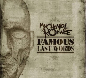
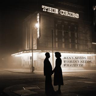
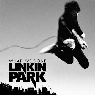
Apart from the ‘For He’s a Jolly Good Felon’ cover (last one), all of these covers are black and white (or have minimum colour). This suits the alternative rock genre because most of the songs in this genre address issues of social concern, which could be why black and white is used (for more grim purposes or to show that the issues are as clear to the bands as black and white).


(Indie Rock/Post-Punk Revival)


(Alternative Rock)


(Alternative Rock)


(Alternative Rock)


(Alternative Rock)

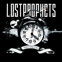
The last cover, by ‘Lostprophets’, has a blue colour running through it in order to contrast to the black background and allows the white text to stand out more. The effect of having streaks of colour could be quite a useful technique for my album cover.

Sunday, 9 October 2011

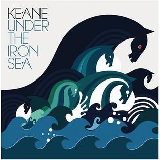
Existing Album Cover Artwork - Interesting Ideas/Concepts


(Alternative Rock/Post-Britpop/Electronica)


(Hardcore Punk/Punk Rock)


(Hardcore Punk/Punk Rock)

The last two do not actually have the title of the songs or the band name on them but are both by ‘Gallows’ and are from the same album. I like the way that the simple graphic design used on the ‘Keane’ cover with the charging horses gives a very different affect to the more detailed designs of the shark and octopus on the ‘Gallows’ covers.
The ‘Keane’ cover has intertextuality references to the painting called ‘Neptune’s Horses’ by Walter Crane (shown below):

(Neptune's Horses by Walter Crane)

For some reason, the second one (called ‘In the Belly of a Shark’) reminds me of the film ‘Jaws’ because of the way that the shark is attacking the boat. Whether that was the intention or not; I have no idea. What these covers have given me is an initial idea into what I could use in order to add intertextuality references into my Digipak artwork and make it more interesting and eye-catching (even if it is not as detailed as the ‘Gallows’ covers).

Edited Photos of 'Whistle Way' - Possible Digipak/Advert Artwork

 These are just some images that I took while at ‘Whistle Way’and thought that I would be a good idea to try out some editing effects using Photoshop Elements. As an overview, I think that the black and white and more subtle colours work well and that the pure black and white (top one) maybe is too strong for the mood from the song. A subtle blue could work also for the Digipak design.


Mise en Scene – Costume (Light vs. Dark)

Edited Photos of 'Scare Farm' - Photoshop Elements Effects

Using one of the images from the ‘Scare Farm’ location shoot, I edited it using Photoshop Elements to see which effects might work well with the image and which do not. The one that I think suits the genre of music the most is the middle one. I think that the effect softens the picture and lightens the overall colours, making it more suitable for the song.


Typography Research - "How to Choose a Typeface" Article

How to Choose a Typeface - 'Smashing Magazine' Website

I came across this website when researching into album artwork for the rock genre. I found the information and advice on this website very useful when starting to have a look at the possible typeface to use on my Digipak/Advert in order to suit the genre and audience of the song/musician.

Sunday, 2 October 2011

Production Schedule - Music Video (Whistle Way)

This is the Production Schedule for Wednesday afternoon’s filming. In this shoot, I will be filming the sequences of shots which include both Amy and Joe. I will also film many different shots so that I can choose the best suiting one for the music video during post-production. Wednesday’s shoot will be at Whistle Way.
(Click on Image to Enlarge)

Shoot Schedule - Music Video

This is the overall Shoot Schedule for the music video. It excludes any photos required for the magazine advert/digipak (I will construct another Shoot Schedule for the Photography Shoot). This will really help me when filming because I know exactly what is required in each shot and so props, locations and technical kit can be arranged easily before the shooting date.

Animatic - Music Video

I have constructed this animatic using the storyboard from the previous post. I have cut them roughly to the required length on Adobe Premiere Elements (that is the software I am going to use to edit my actual music video) and have added the music track to see if there are any issues related to the storyboard. I can conclude that maybe some of the timings will be an issue (such as shots being far too long) and that I now need to gain feedback from my teacher in order to see if the storyboard needs work. Now that I have completed the storyboard and the animatic, I can now go on to produce the Production Schedule and a Shoot Schedule to help me further with the filming and post-production stages.

Storyboard – Music Video

This is the storyboard for my music video. I know that this storyboard is rough, but it shows nearly all of the information that I will need when shooting and editing. I will of course improvise some shots on the day, and I will use the timings from the ‘Lyrics and Timings’ sheet that I developed earlier to edit my storyboard.


Location Shots - 'Whistle Way'

These are the photos that I took when I visited ‘Whistle Way’. Like with ‘Scare Farm’, I took many photos because there was such a wide range of possibilities that could be done. What I did really like about the location was the colours involved with the trees and leaves. There was a mix of browns/orange colours; which I think would give a good effect because it shows that the relationship is becoming old/dying – like the leaves are. This could also be another visual metaphor so I need to take this into account when storyboarding.